It’s official: A new iPhone cometh!
If you’ve been paying attention, you know that one of the iPhone 6’s biggest updates (literally) is a larger screen. Actually, make that two larger screens: Apple is introducing both a 4.7″ version and a 5.5″ alternative (for gorillas). In order to keep those retina display pixels invisible, this means that Apple has made a pretty drastic resolution increase on both of these devices, compared to previous models.
Here’s how they stack up:
The million dollar question: How will this increased resolution affect responsive design?
Drum roll, please…
The answer is: Not much at all.
That is, of course, if your website is properly responsive.
So why not?
The whole point of responsive design is that it’s flexible. When done properly, your site should be able to fluidly adjust to any screen width – from a desktop display, to an iPad, right on down to an iPhone 6, 5, 4 (or, heck, even 3).
Plus, don’t forget that responsive design isn’t just for Apple devices (there’s a great, wide world out there). Current responsive design is already handling a range of devices like a champ, from the Galaxy Note, to the Nokia Lumia, or the Google Nexus 5, all of which have varying resolutions which match or exceed the new iPhone resolutions.
I’ll reiterate that last point: The 5.5″ full HD iPhone 6 screen, which is the highest resolution screen you can possibly get on an iPhone, is not new ground, in terms of displaying your website. There are dozens of devices, some of which have been out for over a year, with the same screen resolution. In fact, both Samsung and LG are surpassing this mark with even higher resolutions on their new flagship smartphones.
The bottom line: If your website works well on most smartphone displays now, it’s going to be fine on any flavor of iPhone 6, right out of the box. You can breathe easy.
That said, you’ll still want to make sure you’re sticking to responsive design best practices, so you’ll be good to go when the first 4K phones hit the shelves.
In the meantime, we all ought to be pondering how we’re going to inevitably crunch our websites down for smart watches and virtual reality headsets.
Latest Posts
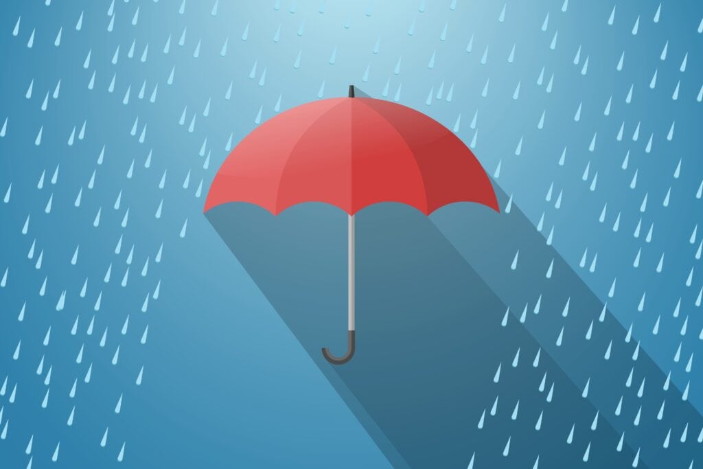
Digital Resilience in Uncertain Times: Building Crisis-Ready Websites
If we’ve learned anything from the past few years, it’s that disruptions can happen…
Keep ReadingBeyond Compliance: Why Accessible Websites Still Fail Users
When it comes to accessibility, focusing solely on compliance means you’re probably missing out…
Keep ReadingThe Honest RFP Guide: Finding Your Ideal Web Partner
Your organization needs a new website, and you’ve been tasked with finding the perfect…
Keep Reading